Due to Unforseen circumstances, our Bust competition has finally been able to draw a conclusion. Judges have given valuable insights and reviewed the submissions and we now have the final rundown of the cauculated points.
The Bust's will remain in display at DMZ for a shortwhile. Feel free to come in to see them during opening hours.
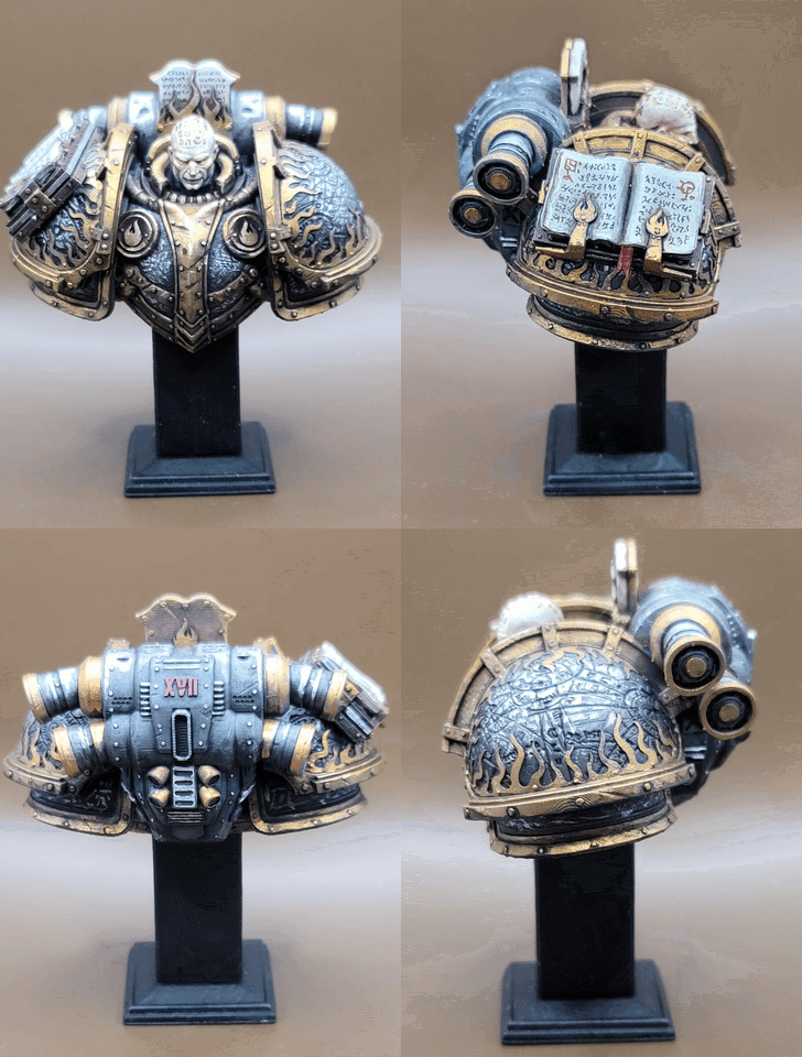
Winner - Jonathan Johnson

 |
 |
 |

|
Comment's by Judge A
The use of colour , helped set the mood for the overall atmosphere for the theme , The free handed scriptures were a nice touch. And the OSL (Objective source lighting) was done very precisely. The metallics could have been finished much more thoroughly as the layers were thin enough to see the underlying paint. Some of the colour’s could have been done more balanced.
Comment's by Judge B
Great Freehand on the grimoires, afew details could have been touched up more neatly and some areas needed cleaning up but the way the bust was presented in the main facial features were well done enough to stand out.
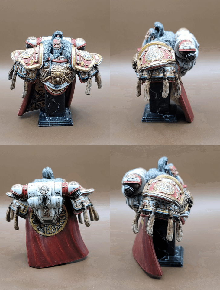
2nd place - Albert Leung
 |
 |
 |

|
Comment's by Judge A
The finish on the overall model was very clean, the combination of color were well done, but some light and darker areas could use some more distinction. The lion head on the pauldron and the angelic decoration on the backpack could not stand out to its full potential. But overall to keep using white as a base is not out of the question but some form of watered down blue or even brown shades could have helped with making these 2 details shine a warmer glow.
Comment's by Judge B
The overall Finish was Crisp and clean, alot of features were outstanding and the metallics looked sharp. This was a close contender for 1st place.
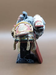
3rd place - Will Chan

 |
 |
 |

|
Comment's by Judge A
All the right colors were used and they were meshing well into the color scheme, especially that the stand of the bust was painted with a marble effect. The freehanded details were sadly too covered to be shown well enough and that was a shame. Some areas were too thick with layers which could have been watered down a bit more to allow a smoother build up. The paints used were too glossy and some matt varnish could have helped to tone it down. Finally the bright and darker areas on the bust could have used some more attention to bring out a better contrast.


